Building beautiful pages is easy with Wowchemy’s no-code block system.
No programming is required, just choose your blocks and arrange them how you like!
Loading pre-made layouts is a great way to kickstart your new homepage. Templates come with some popular blocks pre-configured for this purpose.
Content blocks empower you to fully customize your site. They display as sections on landing pages such as the homepage.
Multiple pre-designed blocks can be added, removed, and positioned as desired on your page. For example, you can use the Experience block both in an “Experience” section and in an “Education” section on your homepage.
Looking to build and publish a block that doesn’t exist yet? Create a new block - or just paste your shiny new HTML layout into the Markdown block together with your content.
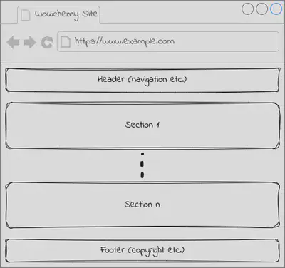
The block system enables you to easily choose different blocks (designs) for the header (such as navigation bar), page sections, and the footer (such as copyright and links).
We’re full steam ahead on improving Wowchemy, and we need your help!
- ❤️ Become a backer on Patreon or GitHub and unlock these rewards and extra features
- ⭐️ Star Wowchemy on GitHub
- 👩💻 Contribute code, PR reviews, documentation, color themes, tutorials, etc.
How do I use blocks?
Templates come with some popular content blocks pre-configured as homepage sections.
Start by opening your homepage at content/_index.md (or content/home/ for older sites) in the GitHub editor by going to this file in your GitHub repository and clicking the pencil icon to edit the file.
Delete any homepage sections that you don’t need and personalize the remaining section options. For example, you can set a custom color, image, or video based background for each section.
Remember to update your navigation menu in config/_default/menus.yaml if you need to add or remove links to your homepage sections after editing them. For example, if you change the id of the contact section from contact to contact-me, then you can update the /#contact link in menus.yaml to /#contact-me.
Create a section
To add a section to the homepage, create a new YAML item under sections in your content/_index.md.
Explore the Blocks page to find the content blocks that you wish to use in your site. Then copy and paste the block’s options into the YAML front matter of your Markdown page.
Remember to configure your sections within the page’s front matter, i.e. between a pair of triple dashes --- that represent YAML parameters.
The site Header and Footer blocks are special cases which can be customised within your config/_default/params.yaml.
For example, here are two text-based sections:
---
# Page title
title: My page
# Page type - we want a landing page (such as a homepage)
type: landing

# Your landing page sections - add as many different content blocks as you like
sections:
  - block: markdown
    id: section-1
    content:
      title: Section 1
      subtitle: A subtitle
      text: Add any **markdown** formatted content here - text, images, videos, galleries - and even HTML code!
  - block: markdown
    id: section-2
    content:
      title: Section 2
      subtitle: A subtitle
      text: Add your Section 2 content here...
---
You can also add any common block options documented on this page, such as title, to the front matter.
You can link a homepage section from the site menu by editing config/_default/menus.yaml and adding the id of your section. For example, if your section has an id of section-1, reference it as "/#section-1" in the menu URL.
You can create as many content blocks as you wish, with each appearing in its own section.
Remove a section
If you do not require a particular section, you can simply delete any associated sections from the homepage at content/_index.md.
Taking the example above, we remove the second section, leaving us with only the first section:
---
# Page title
title: My page
# Page type - we want a landing page (such as a homepage)
type: landing

# Your landing page sections - add as many different content blocks as you like
sections:
  - block: markdown
    id: section-1
    content:
      title: Section 1
      subtitle: A subtitle
      text: Add any **markdown** formatted content here - text, images, videos, galleries - and even HTML code!
---
After removing a section, you may wish to remove any links to it. To remove a navigation link from the top of the page, remove the associated main menu entry in config/_default/menus.yaml.
Position sections
Page sections appear in the order in which they are defined in your page front matter sections.
Simply cut and past the sections (starting with a YAML - block: ...) in the order that you require them.
To re-arrange homepage sections, edit the sections wihin the content/_index.md file.
Link to a section
You may wish to add a navigation link to the top of the page that points to a section. This can be achieved by adding something similar to the following lines to your config/_default/menus.yaml, where the URL will consist of the id of the section:
main:
  - name: Research
    url: /#research
    weight: 10
Personalizing blocks
The parameters for each section consist of general options in addition to block-specific options.
Here we will discuss the common options that can be used in most content blocks. You can find the block-specific options on the Blocks documentation page.
We recommend using YAML formatted front matter (between a pair of ---). If your front matter is written in TOML syntax (between a pair of +++), you’ll need to convert it before using the YAML formatted snippets on this page.
Title and section text
Most content blocks support a text option where you can add any Markdown-formatted text and image content to a section.
A title and subtitle can be set for most content blocks using the title and subtitle options, respectively.
Columns
The number of columns in a section can be configured for most content blocks. Valid options are:
'1': a single full-width column with the section content appearing directly underneath the section title (if set)'2': two columns with the the section title appearing on the left and the section content appearing on the right
The following blocks support this option: pages, featured, experience, accomplishments, contact, blank, tag_cloud, portfolio
For example:
---
# Page title
title: My page
# Page type - we want a landing page (such as a homepage)
type: landing

# Your landing page sections - add as many different content blocks as you like
sections:
  - block: markdown
    id: section-1
    content:
      title: Section 1
      subtitle: A subtitle
      text: Add any **markdown** formatted content here - text, images, videos, galleries - and even HTML code!
    design:
      # Choose how many columns the section has. Valid values: '1' or '2'.
      columns: '1'
---
Listing view
Several content blocks have a view option to let you choose how content is displayed.
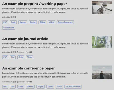
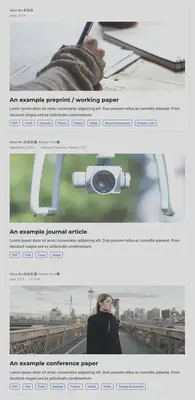
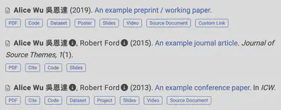
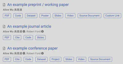
The following content previews are available:
- List (1)
- Compact (2)
- Card (3)
- Citation (4)
- For classic APA or MLA styled publication lists
- Optionally, edit the value of
citation_styleinparams.yamlto APA or MLA
- Showcase (5)
- Masonry
- Intended for use with the Portfolio widget to provide a Pinterest-style layout
- Or, create your own view in
layouts/partials/views/community/<name>.html(creating the folders) and reference it asview: community/<name>where<name>is a unique name for your view (with no spaces in the name)- take a look at the code for the built-in views for inspiration
- consider sharing your new view with the Community on Discord, or publishing it as a Hugo Module
For example, in your homepage at :
---
# Page title
title: My page
# Page type - we want a landing page (such as a homepage)
type: landing

# Your landing page sections - add as many different content blocks as you like
sections:
  # A section to display blog posts
  - block: collection
    id: section-1
    content:
      title: Section 1
      subtitle: A subtitle
      text: Add any **markdown** formatted content here - text, images, videos, galleries - and even HTML code!
      # Display content from the `content/post/` folder
      filters:
        folders:
          - post
    design:
      # Choose how many columns the section has. Valid values: '1' or '2'.
      columns: '1'
      # Choose your content listing view - here we use the `showcase` view
      view: showcase
      # For the Showcase view, do you want to flip alternate rows?
      flip_alt_rows: true
---
What text is shown in the preview?
The built-in listings get the summary text for each listing from the page’s summary or abstract field. If you don’t provide that field, then Hugo will automatically generate a summary. You can also use Hugo’s <!–more–> summary divider in the body of your content, where you want to split the article.
Icons
Wowchemy enables you to use a wide range of icons from Font Awesome and Academicons.
Icon pack “fab” includes the following brand icons:
- twitter, weixin, weibo, linkedin, github, facebook, pinterest, twitch, youtube, instagram, soundcloud
- See all icons
Icon packs “fas” and “far” include the following general icons:
- fax, envelope (for email), comments (for discussion forum)
- See all icons
The Academicons icon pack, icon_pack: ai, includes the following academic icons:
- cv, google-scholar, arxiv, orcid, researchgate, mendeley
- See all icons
You can enable the academic icon pack extension in params.yaml:
extensions:
  academicons:
    enable: true
Icon pack “emoji” gives you the ability to use emojis as icons
- See all icons
- Enter the emoji shortcode, such as
:heart:, in Wowchemy’siconfield - or just use your emoji keyboard directly
Icon pack “custom” gives you the ability to use custom SVG icons
- Create an SVG icon in your favorite image editor or download one from a site such as Flat Icon
- Place the custom SVG icon in
assets/media/icons/, creating the folders if necessary - Reference the SVG icon name (without
.svgextension) in theiconfield - Custom icons are currently only supported in limited features such as the Features block - please help contribute to the issue to add custom icon support to all Wowchemy features where an icon can be used
Background
A background can easily be applied to any homepage section. Choose from a range of background options including color, gradient, and image. Then choose either a dark or light text color by setting text_color_light, or remove text_color_light for dynamic text color associated with the current light/dark theme.
Once you have chosen the type of background, delete or comment out (by prefixing #) any unused options. For example, if you choose an image background, set the image and text_color_light options and delete the rest (delete color and gradient*). For colors, any HTML color name or Hex value is valid.
The following excerpts show the front matter structure for defining various backgrounds.
Color background:
design:
  background:
    # Choose a color such as from https://html-color-codes.info
    color: 'navy'
    # Text color (true=light, false=dark, or remove for the dynamic theme color).
    text_color_light: true
Gradient background:
design:
  background:
    # Choose colors such as from https://html-color-codes.info
    gradient_start: '#4bb4e3'
    gradient_end: '#2b94c3'
    # The gradient angle from 0-360 degrees
    gradient_angle: 180
    # Text color (true=light, false=dark, or remove for the dynamic theme color).
    text_color_light: true
Image background:
design:
  background:
    image:
      # Name of image in `assets/media/`.
      filename: background.jpg
      # Apply image filters?
      filters:
        # Darken the image? Range 0-1 where 1 is transparent and 0 is opaque.
        brightness: 0.6
      #  Image fit. Options are `cover` (default), `contain`, or `actual` size.
      size: cover
      # Image focal point. Options include `left`, `center` (default), or `right`.
      position: center
      # Use a fun parallax-like fixed background effect on desktop? true/false
      parallax: true
      # Text color (true=light, false=dark, or remove for the dynamic theme color).
      text_color_light: true
Video background:
design:
  background:
    video:
      # Name of video in `assets/media/`.
      filename: background-video.mp4
      # Post-processing: flip the video horizontally?
      flip: false
You can also specify a background color (see Color Background) similar to the video for a better user experience whilst the video is loading.
Spacing
The spacing of sections can be controlled by specifying padding for the top, right, bottom, and left sides of sections.
For example, to make a section more compact, the following parameters can be added to the front matter of a section. This example will reduce the top and bottom spacing of the section to just 20 pixels (px).
design:
  spacing:
    # Customize the section spacing. Order is top, right, bottom, left.
    padding: ["20px", "0", "20px", "0"]
Style
It’s possible to customize the style of a specific instance of a widget with CSS. For example, the font size of a section can be changed.
First, define your custom style in CSS using the CSS Plugin feature.
To apply your new style to a widget, set css_class in a widget’s front matter. For example css_class: "MY_CSS_CLASS", where MY_CSS_CLASS is the name of the CSS class which you defined in the previous step. You can add multiple classes, separated by a space.
Custom CSS code can also be directly applied to a section using the css_style option.
design:
  css_style: ''
  css_class: ''