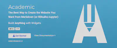
The Hero widget can be used to encourage visitors to perform an action (CTA). It’s the first thing that visitors see when they visit your website, and it influences the way your visitors feel and behave on your site.
Typically, the Hero widget is configured to include a hero image, a tagline and a call to action (CTA). There are other possibilities as well though, such as including a secondary action, note, and background.

Edit the front matter of home/hero.md to add the primary action that you would like your visitors to perform.
For example, the following options can be added to your section front matter in order to include the Hero widget:
---
widget: hero
headless: true  # This file represents a page section.

# Put Your Section Options Here (title, background, etc.) ...
title: My Hero
weight: 10 # Position of section on the page

# Hero image (optional). Enter filename of an image in the assets/media/ folder.
hero_media: ''

# Call to action links (optional).
#   Display link(s) by specifying a URL and label below. Icon is optional for `cta`.
#   Remove a link/note by deleting a cta/note block.
cta:
  url: 'https://wowchemy.com'
  label: Get Started
  icon_pack: fas
  icon: download
cta_alt:
  url: 'https://wowchemy.com'
  label: View Documentation

# Note. An optional note to show underneath the links.
cta_note:
  label: ''

# Choose an optional background color, gradient, image, or video
design:
  background:
    gradient_end: '#1976d2'
    gradient_start: '#004ba0'
    text_color_light: true
---

Add an intro paragraph here.
In this example, we have associated an icon with the action (cta option).
